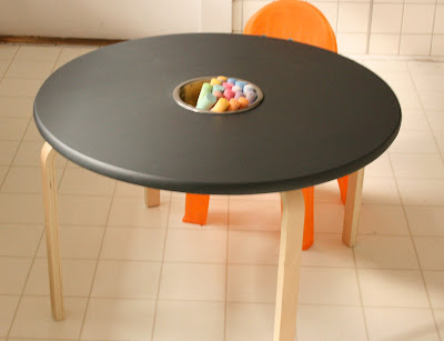
First, apologies on the delayed "after" pic of Liams new table. As it happens I used leftover chalkboard paint that wasn't sealed well after I last used it....about 7 months ago. The result? The paint went on a bit goopy and streaky. I need to sand it down to get rid of the streaks and then I will apply another coat of BRAND NEW paint. Liam has been loving his new table at any rate. Learned my lesson on that one.....
Now on to some eye candy you can actually look at! I recently finished doing a master bedroom in Rhode Island. The busy family of 5 moved into their "forever" home last year and have been patiently waiting to get settled into their space before deciding to undertake some major redecorating throughout the house. First on their list was their master bedroom. The wife loves a contemporary feel with classic lines, and luckily the husband was happy with whatever she liked! One of her favorite colors is blue, which ended up being the starting point of a relaxed and luxurious master bedroom retreat.
Take a look at the lackluster before:
Ho hum walls, hand me downs not worth keeping (words of my client) and some bedding that has been well loved.
The Design Board:
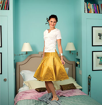
Now for the after:
We completely revamped the room with new furniture from Potterybarn, Crate & Barrel, Boston Interiors, and Art.com. The only special orders were the two euro pillows with handprinted fabric from Galbraith & Paul (well worth the wait!!!) and the custom king size Filmore headboard from Boston Interiors. Even the silk duponi drapes were ordered stock from Potterybarn and then hemmed to the correct length and hung on drapery rings for a custom look.


.JPG)

